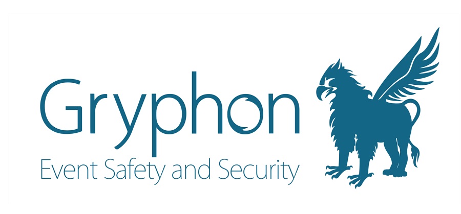
A complete re-engineering of the clients logo to introduce a sharper and more stylised and professional brand, avoiding all obvious ‘engineering’ icons and imagery

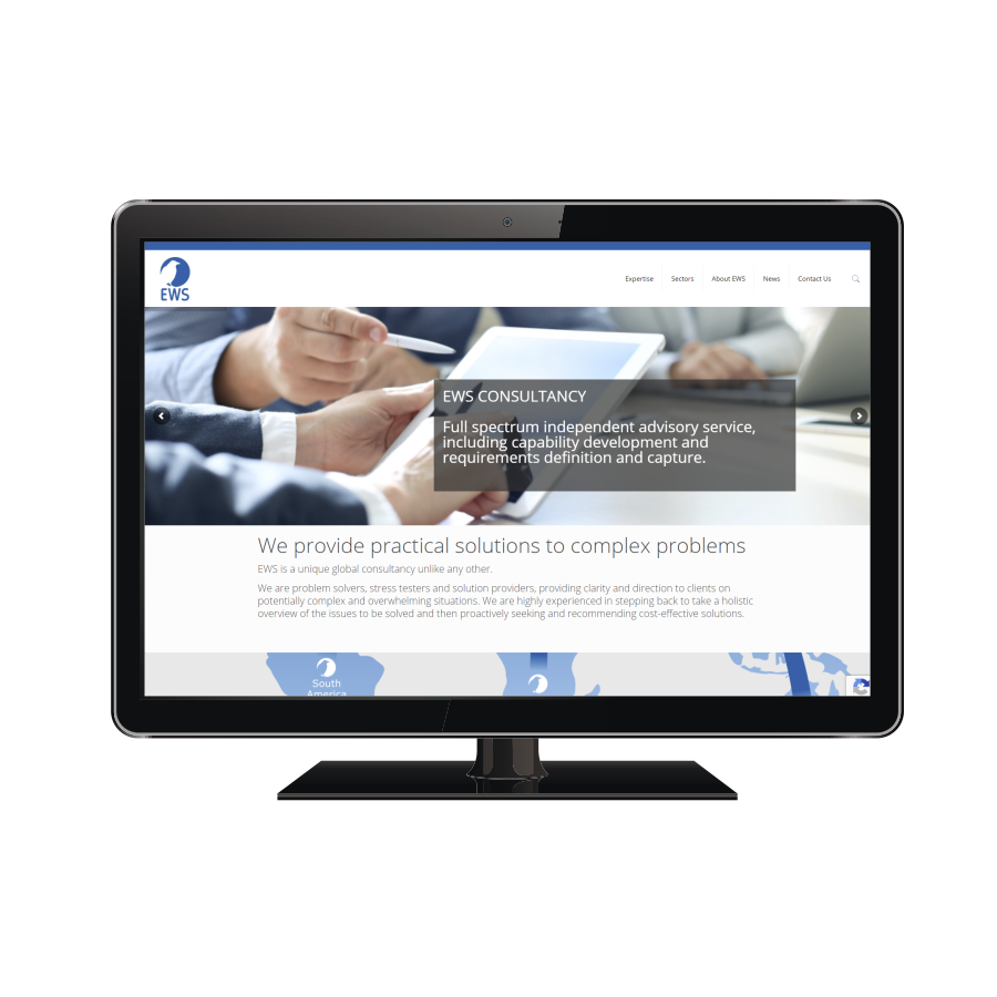
EWS: Website Design and Build
24 November 2020


A complete re-engineering of the clients logo to introduce a sharper and more stylised and professional brand, avoiding all obvious ‘engineering’ icons and imagery